Africa’s Map Revolution: UN General Assembly Backs More Accurate Representation of the Continent
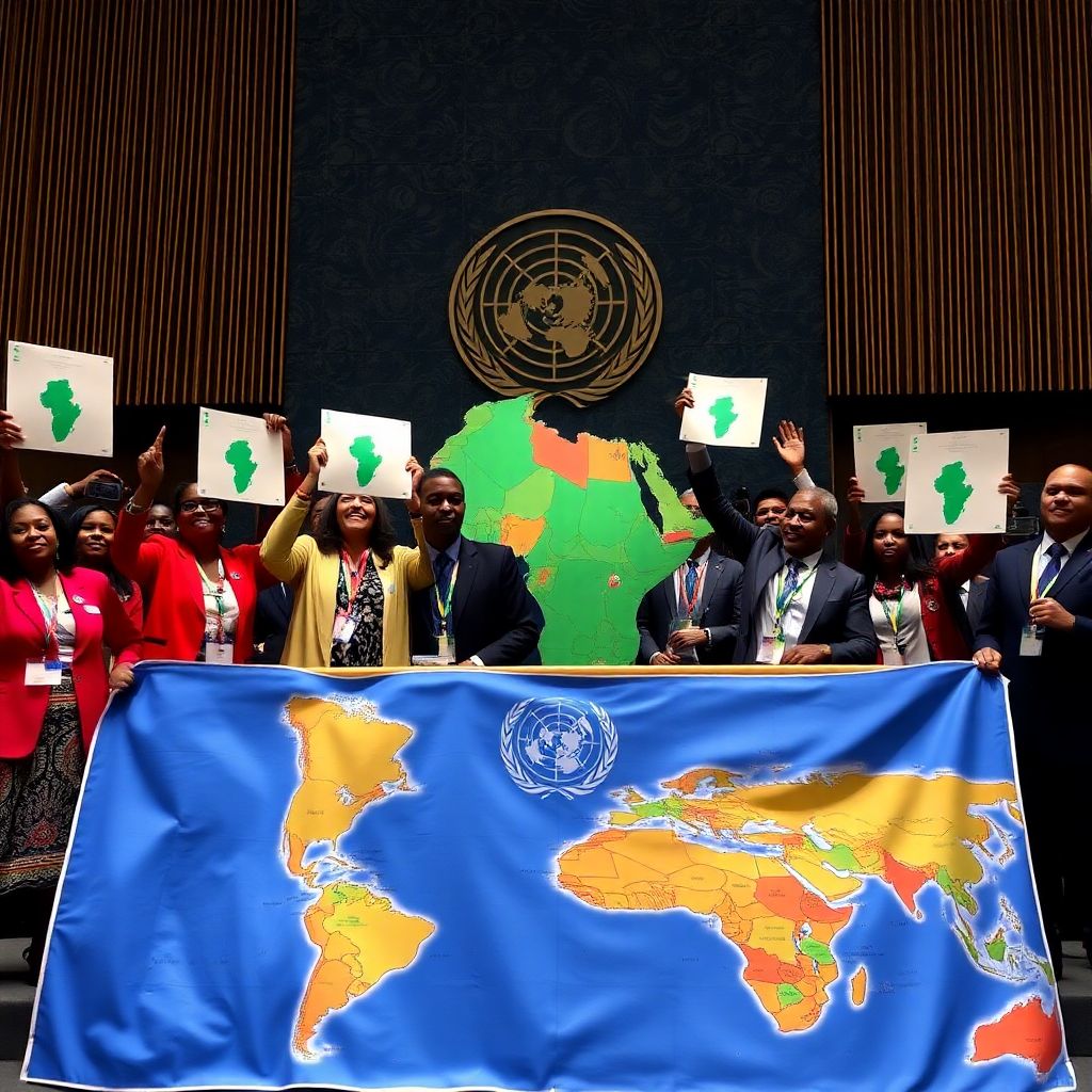
The United Nations General Assembly has approved a proposal calling for Africa to be shown closer to its true size on official world maps. The “Correct the Map” resolution, introduced by Togo and supported by members of the African Union, received the backing of 164 countries. The United States was the only country to vote against it, while six countries abstained.
Although the decision is not legally binding, it carries considerable symbolic and practical importance. It is expected to encourage international institutions, educational organizations and mapping services to reconsider the projections they use when depicting the world.
The main target of the debate is the Mercator projection, which has been widely used since the 16th century. On this map, Africa and Greenland appear to be roughly comparable in size. In reality, Africa is approximately fourteen times larger than Greenland. The distortion also makes countries near the equator appear smaller than they are, while territories close to the North and South Poles are shown disproportionately large.
The problem does not result from a simple drawing error. A spherical planet cannot be transferred onto a flat surface without some form of distortion. Every map projection must prioritize certain features, such as direction, distance, shape or area. Gerardus Mercator, the Flemish cartographer who developed the projection in 1569, designed it primarily to help European sailors navigate across the oceans. For maritime travel, preserving angles and compass directions was especially useful.
However, a projection created for navigation can create misleading impressions when it is used in classrooms, news reports, digital platforms and political communication. Over time, the visual hierarchy of the map may influence how people understand the importance, scale and influence of different regions.
Supporters of the resolution argue that the issue is therefore not merely technical. They say maps can shape public perception by making some countries appear central and powerful while making others seem marginal. Africa’s geographic scale, population, natural resources and economic potential can be underestimated when the continent is repeatedly displayed in a distorted form.
Togo’s Foreign Minister Robert Dussey, who played a leading role in presenting the proposal, emphasized that maps are never completely neutral. According to his argument, a fairer world should also be represented through a fairer visual framework. A map influences how societies understand the position of peoples and continents in the global system.
The African Union has also supported alternatives to the Mercator model. In February, its 54 member states adopted the Equal Earth projection, a design developed in 2018 by a group of cartographers. Unlike the Mercator projection, Equal Earth aims to preserve the relative size of land areas more accurately. The African Union stated that the projection offers a fairer representation of all continents, particularly Africa.
The #CorrectTheMap campaign has used a striking comparison to explain the difference in scale. It argues that the United States, China, India, Japan, Mexico and much of Europe could fit inside Africa, with significant space still remaining. Such comparisons are intended to demonstrate how deeply conventional maps have shaped inaccurate visual assumptions.
France has signaled support for the change as well. Foreign Minister Jean-Noël Barrot announced that his ministry would no longer use the Mercator projection. He acknowledged that replacing a map would not transform the world itself, but argued that correcting a representation that distorts reality is an important act of truth.
The United States opposed the resolution. Its representative to the United Nations, Yaryna Ferencevych, criticized the General Assembly for focusing on historical map projections instead of what she described as urgent issues involving international peace, prosperity and relations between states. She also objected to the connection some advocates make between cartographic representation, reparations and the concept of cognitive justice.
The disagreement reflects a broader debate about colonial history and the way knowledge has been organized. Many of the maps most familiar to audiences around the world were created within European intellectual and political traditions. As a result, their conventions often became global standards, even when they were not designed to provide an equal-area picture of the planet.
Changing the projection will not by itself resolve economic inequality, political instability or development challenges. Nevertheless, advocates believe that visual accuracy matters because education and public discourse are built partly on repeated images. When a particular representation is used for generations, it can become embedded in collective thinking.
The choice of projection is especially important in schools. Students who see Africa displayed in its true relative size may gain a clearer understanding of the continent’s geography and diversity. They can also more easily recognize that Africa is not a single uniform region, but a vast landmass containing 54 countries, multiple climate zones, major linguistic communities and a wide range of political and economic systems.
Digital mapping services face a separate challenge. Online maps frequently prioritize navigation, zooming and technical usability rather than equal-area accuracy. Different projections may therefore be appropriate for different tasks. A navigation application, an election map, a climate chart and a classroom world map do not necessarily need to use the same system.
Experts also note that no projection can provide a perfect image of the Earth. Equal-area maps preserve the size of territories but may alter their shape, direction or visual proportions. For this reason, the debate is not about finding one universally flawless map, but about selecting the projection that best matches the purpose for which the map is being used.
The decision may lead international organizations to review their internal standards, educational materials and public communication tools. It could also encourage publishers, broadcasters and technology companies to explain the limitations of the maps they display rather than presenting one projection as an unquestionable picture of reality.
For African countries, the campaign has an additional political dimension. A more accurate map can support efforts to challenge outdated narratives that portray the continent mainly through poverty, crisis or dependency. By emphasizing its actual size and diversity, advocates hope to draw greater attention to its markets, infrastructure needs, cultural influence and investment opportunities.
Ultimately, the UN vote is unlikely to make the Mercator projection disappear immediately. It remains useful for some navigation purposes and is deeply established in software, textbooks and institutional systems. Yet the resolution may mark an important shift in awareness: the map on the wall is not the world itself, but a chosen interpretation of it.
The central message of the campaign is that representation matters. Showing Africa accurately cannot solve every problem facing the continent, but it can correct a long-standing visual imbalance and encourage a more informed understanding of Africa’s place in the world.